Table of Contents
List of figures. 3
List of abbreviations. 4
1 Introduction to the paper 5
2 Mobile web. 6
3 Websites on multiple screens. 10
3.1 CSS3 Media Features. 10
3.2 General website structure and design.. 12
3.3 Specific device adaptations of the website layout 14
4 Mobile web application development 17
4.1 JQuery Mobile. 17
4.2 JQuery Mobile sample application.. 18
4.3 Sencha Touch.. 19
4.4 Sencha Touch Sample Application.. 22
5 Literaturverzeichnis. 23
Figure 1 - Structure of the Website. 13
Figure 2 - Desktop Homapage on Google Chrome. 15
Figure 3 - Website schreenshots from an HTC Sensation.. 16
Figure 4 - Task Manager UI (JQuery Mobile) 18
Figure 5 - Sample Sencha Touch Application [] 21
Figure 6 - Sencha touch Task manager app. 22
List of figures. 3
List of abbreviations. 4
1 Introduction to the paper 5
2 Mobile web. 6
3 Websites on multiple screens. 10
3.1 CSS3 Media Features. 10
3.2 General website structure and design.. 12
3.3 Specific device adaptations of the website layout 14
4 Mobile web application development 17
4.1 JQuery Mobile. 17
4.2 JQuery Mobile sample application.. 18
4.3 Sencha Touch.. 19
4.4 Sencha Touch Sample Application.. 22
5 Literaturverzeichnis. 23
List of figures
Figure 1 - Structure of the Website. 13
Figure 2 - Desktop Homapage on Google Chrome. 15
Figure 3 - Website schreenshots from an HTC Sensation.. 16
Figure 4 - Task Manager UI (JQuery Mobile) 18
Figure 5 - Sample Sencha Touch Application [] 21
Figure 6 - Sencha touch Task manager app. 22
List of abbreviations
|
CSS |
Cascading Style Sheets |
|
HTML |
Hypertext Markup Language |
|
W3C |
World Wide Web Consortium |
1 Introduction to the paper
This paper is written with the intention of describing and outlining state of the art techniques of developing mobile web applications and websites that are adapted to small screens. Therefore an example website that uses advanced features of displaying and interacting with websites on mobile devices is build in addition to writing this paper. This example website is intended to be accessible from PCs, Android based devices, iPhones, and Amazon Kindle devices and will adapt its appearance to the respective displaying limitations.
The paper starts with giving an overview of current limitations and facilitations that are related to creating content that is intended to be consumed on mobile devices. It then continues with giving detailed examples of how to develop websites that adapt to devices with limited displaying capabilities in chapter 3. In this chapter, the design of the example website is outlined in detail. Chapter 4 then continues with giving an overview of currently available web development frameworks that support creating cross-platform web applications.
The example website is intended to be similar to a personal homepage. It is divided into four parts:
- The homepage,
- a personal blog,
- a simple project repository, and
- a Curriculum vitae of the person owning the website.
A sample mobile web application for managing tasks is hosted in the project repository.
2 Mobile web
In recent years devices for accessing the internet are shifting from personal PCs to mobile devices [1]. Fortunately, modern Smartphones, Featurephones, and even eBook reader usually ship with modern web browsers that support a multitude of features to optimize websites for devices with small screens – that do not have the same download speed as cable-based internet connections – or at least allow the user to install a new browser that offers these features. To give an example, iOS implements a mobile Version of Safari that has nearly the same features as its desktop counterpart since the first version of the iPhone. All devices that run Android ship with a browser that behaves similar to Google Chrome for the most part and future versions of Android might even include a complete desktop port . While Microsoft implemented Internet Explorer 7 in the first version of Windows Phone 7, the upgrade to Windows Phone 7.5 Mango ships with Internet Explorer 9 by default. Furthermore, although there exist a lot of devices that do not include modern browsers by default, it is well possible that either Opera Mobile or Opera Mini could be installed and run on such devices.
What is even more interesting, modern Nokia Phones, Blackberry Smartphones, the iPhone as well as Android based devices ship with implementation of WebKit. WebKit is an open-source web browser engine that is even used on eBook readers like the Amazon Kindle. Thus, while each company can use self-made extensions, all browser implementations share a similar set of functionality and rendering behavior and allow developers to use a large set of website optimizations for mobile devices.
Browsing the web on mobile devices is common for years. Unfortunately, websites that display a lot of information at once might be less usable on devices with small screens. What is worse, some websites do not work at all as they are either bad designed or expect interaction behavior, such as hovering over a link, that simple does not exist on touch enabled devices. To encounter these problems, there has already been a trend in recent years that serve side applications parse the user agent string that is sent with the HTTP request from client browsers – including the client device type – and then, if they identify a mobile user agent, display a different website.
This technique of determining the user agent and the client device usually works as expected. There exist several disadvantages to this approach, though. Firstly, developers need to implement two web sites instead of a only one, which might lead to more complex application logic. Secondly, while browsers sent their device type via the http-header to the server, modern Smartphones usually do not identify themselves as handheld devices. What is more, methods of detecting the actual device might differ between Smartphones and, thus, it is not guaranteed that all mobile devices are redirected to the mobile version of the website. Thirdly, even Smartphones differ in their displaying capabilities. Smartphone screen sizes range from 2.4” to 4.7” and resolutions of Smartphones range from 320x240 to 1280x720. Thus, only determining that the device is a phone does not necessarily mean that the mobile version of a website is well adapted to the respective device screen. As a result, it is usually better to adapt the appearance of a website to the actual displaying and interaction capabilities of a device rather than to the device type.
As a consequence, as mobile devices are more frequently used to access the Internet, the World Wide Web Consortium (W3C) implemented new procedures of adapting the appearance of a website to client device displays with Cascading Style Sheets (CSS) media queries. Media queries are introduced with CSS 3 and enable developers to change the appearance of a website according to specific client device hardware and software setup such as device or browser width, browser width to height aspect ratio, device orientation, and more. And, while CSS 3 is not finalized yet, the media query module has Candidate Recommendation Status and, thus, will not be changed in the future. Furthermore, all modern Web Browser, including Internet Explorer 9 and above, can handle media queries.
With recent advancements of browsers running on mobile devices, web applications that are optimized for handheld devices will become more common. In this respect, web applications for mobile phones share the same advantages with web applications for PCs and, in some circumstances, even surpass them. At the same time, mobile web applications share – with some exceptions – the same disadvantages as desktop applications. The next section outlines some of the major advantages and disadvantages of web applications[2].
Cross-Platform and Cross-Device compatibility
There exist a multitude of operating systems that an application might run on. To accomplish this, different source codes or at least different compilers for creating platform dependant code are needed. In contrast most modern platforms feature a web browser that is capable of running modern web applications. So, instead of writing different versions of program code for multiple platforms, developers only need to create a single version of a web application. As a result, web applications can be written to run on nearly all desktop computer operating systems, but also on other devices like mobile phones or internet-enabled televisions.
More manageable and a centralized data infrastructure
Web applications are installed on the server and can then be accessed by client devices. While developers have to assume that clients access their applications using modern web browsers, all changes, including bug fixes and that like, can be made at a central point that is controlled by the application provider. What is more, all client application data can be stored in a centralized data infrastructure. Hence, web applications can be used from anywhere as long as clients have a connection to the web and can authenticate themselves and, thus, simplify the process of synchronizing user specific information across different client devices. As most user specific information is stored centrally, implementing mechanisms to prevent information loss because of hardware failure might be easier than with applications that store information locally. In contrast to this, data theft could be made easier as the attacker only needs the victim’s username and password for the online application.
Internet connection is a prerequisite
Although being able to synchronize user information between different devices that works out of the box is quite helpful, it always depends on the device being connected to the internet. In fact, most web applications heavily depend on an established internet connection and cannot run without it. The W3C is aware of that and include modules that handle offline web application in HTML5 [http://www.w3.org/TR/offline-webapps/]. While several features are implemented in web browsers of current mobile devices, web applications might still fail to work without being connected to the internet.
Browser adaptation
While a web application can run across any kind of device as long as it runs in a browser that is capable of rendering it, there is a broad range of browsers that are in use today which have a different state of HTML, CSS and JavaScript support. Thus a web application needs to be adapted and tested in all browsers that are relevant to the application’s audience. Fortunately with the current state of browser support it is possible to create websites that look similar across all modern browsers with a single code base and due to recently published JavaScript frameworks for mobile devices, it is even possible to create native-looking web applications from a single code base that run on all major mobile web browsers.
3 Websites on multiple screens
CSS3 media queries are preferred way of adapting websites to multiple devices and screens. There are three different ways of implementing media queries in a website[3]:
Firstly media queries can be applied to the LINK tag that includes a CSS file:
file” rel=”stylesheet” media=”logic media and (expression)”
Secondly CSS files can be imported using the @import statement:
Thirdly media queries can form building blocks within a CSS file:
@media (orientation:landscape) {
body{ font-size: 17px; }
}
Hence, media queries form conditions if respective CSS declarations will be applied to the current web document. Media queries use so called Media Features to detect if the CSS rules apply to the current environment.
3.1 CSS3 Media Features
The following examples show what can be checked with Media Features:
Browser Width and Height
Conditions can be applied if the viewport, which usually is the browser window, has a specific width or height. The appearance of the website can change dynamically if the browser is resized. As defining a specific width or height is too precise for the most time, this Media Feature can be used with Min- and Max- prefixes. A media query using this Media Feature might look like this:
@media all and (min-width: 960px) { #navigation li { float:left; } }
Using the Width of the browser to change the website appearance is probably best suited to adapt the website to browser resizing on desktop PCs.
Device Width and Height
The device width and height works similar to the browser width and height. The only exception is that the resolution of the display is taken into account instead of the viewport. A media query using this Media Feature might look like this:
@media all and (max-device-width: 800px) { body { font-size: 12px; } }
According to [1] the device-width becomes most useful when designing for mobile devices. What is important is that iOS and Android based devices always use the shorter pair of the screen resolution as device-width[3].
Device Orientation
To improve the usability of websites on mobile devices it is possible to take the device orientation into account. For example some page components can be displayed next to each other in landscape mode while they are displayed beneath each other in portrait mode. What is more, the application behavior could change depending on the orientation of the device. As a consequence a website could be easier to be consumed for reading articles in landscape mode and, once the user wants to give an input, have some advanced features in portrait mode.
Tests with modern Versions of Google Chrome and Mozilla Firefox when creating the example website showed that even desktop browser switch between Portrait and Landscape mode depending on the ratio between width and height of the browser window. While using this Media Feature is helpful on Smartphones, it is probably even better suited to design websites specifically for tablets. A media query using this Media Feature to place parts of a website next to each other might look like this:
@media (orientation:landscape) { #content-main, #content-sub { float:left; } }
Aspect Ratio and Device Aspect Ratio
Media Queries can be used to adapt the website to specific aspect ratios of the viewport or the device screen. Thus it is possible to optimize the website for 16:9 aspect ratios and so on. Unfortunately some mobile phone manufacturers do not use 16:9 ratios but similar ratios like 16:10 or 15:10. In these situations, all of these ratios need to be included if the website should be optimized for such devices. The following example demonstrates a use of this Media Feature to exchange the logo background with a widescreen image:
@media (device-aspect-ratio:16/9) { #logo {background: url(wide_logo.png)}}
Pixel Ratio
At least Mozilla Firefox and WebKit based browsers on the iPhone, Android, and Amazon Kindle include an implementation of Pixel Ratio media queries. Some modern Smartphones use more than one pixel per device pixel to content with a high quality even after zooming in. The iPhone for example has a pixel density of 2, which means that even at 100% zoom the appearance of the website has a high quality. Images, however, cannot have this quality after zooming in. Therefore the Pixel Ratio Media Feature can be used to exchange low-resolution images with high-resolution images if the pixel density is above one [1]. The following example reflects this behavior:
@media (-webkit-device-pixel-ratio:2) {#logo{background: url(high_res.png)}}
3.2 General website structure and design
The website is intended to be similar to a personal website that includes blogging features. Furthermore, web applications are hosted that improve the interaction capabilities of the website on mobile devices. The website is structured as follows:
|
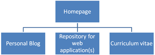
The homepage is structured different than the other pages and gives a short overview of the whole content of the website. The personal Blog is a list of articles that are created by the website owner over time. The application repository is similar to the personal blog but the content is structured differently. What is more, each project article contains a link to the respective web application. In this scenario, there will be one web application listed that helps the user to read specific articles and write comments. Finally, there is a website that contains information about the owner of the website and his or her Curriculum vitae.
The overall structure of the website is very simple. Reasons for this are that this is only a test project and there would not be enough time to build a large website. But from a usability point of view simple websites most usually should be preferred over bloated websites anyway. Furthermore the website and the graphical designs were first designed with mobile devices in mind and then augmented for devices with larger screens, as proposed by[3].
As a consequence the main CSS file called hp.css does all the main styling of the website that is needed for iPhone, Android and Kindle devices as well as larger screens. The file contains only a few sections that use media-specific code to adapt the website to different screens.
Unfortunately these media queries cannot be interpreted by Internet Explorer prior to version 9. If people that use these browsers would arrive at the website they probably could not use it at or at least would render a version that is not optimized for their screen. Therefore a CSS file called hp_large_ie.css is included which contains all code that is needed to adapt the website to large screens. As these versions of Internet Explorer are mainly used on desktop computers providing only CSS that serves large screens will probably not resolve in drawbacks, anyway.
As this second CSS file should only target Microsoft browser, Internet Explorer conditional comments are use which will not be interpreted by any other browser. This conditional comment looks like this:
As a result all devices running internet explorer 8 or older will be served with the desktop styled website. To ensure that our main CSS file is not interpreted by old Microsoft Browser, we use the media query media="only all". This does not affect other browser, but Internet Explorer prior to version 9 does not understand the “only” keyword and therefore do not load this file[3].
3.3 Specific device adaptations of the website layout
First a website is created which is optimized for large screens. The homepage is structured in a header, five regions that float at the center of the browser, and a footer. All other websites differ from the homepage only with the style of the main content. They are aligned in a two-column grid where the main column takes about 60% of the width and the secondary column takes about 40% of the width.
What is special about the CSS is that all media queries, except the query for the Amazon Kindle, are targeting a broad range of devices with different screens. What is more interesting is that the CSS does not target the device dimensions but the browser size. Thus, the website will be adapted to different browser dimensions when the user resizes it. This could even be implemented for the homepage to attach the footer to the bottom of the browser for as long as the height of the browser exceeds a specified number of pixels. Otherwise, the footer could be aligned at the bottom of the main content like it is done in the example website.
The different queries for adapting the website to different screens are as follows:
/*smaller devices (small tablets, smartphones, feature phones)*/
@media (orientation:landscape) and (max-device-width: 1000px){
…
}
@media (orientation:landscape) and (max-device-width: 1000px){
…
}
These two queries are mainly used for smaller devices that will probably not be able to display the columns of the website side-by-side. The difference between the two orientation modes are, for the most part, different font-sizes and the height of both header and footer.
While the content of these devices will only receive a linear structure website, devices that are targeted with the following query receive the desktop-like website structure that is shown in Figure 2.
/*try targeting large screens (tablets, computer)*/
@media (min-width: 1000px) and (orientation:landscape){
…
}
This query targets all tablet-devices that have a resolution of 1280x800px, 1024x768px and 1024x600px (Kindle Fire among others) in landscape mode and lets the content-areas float next to each other.
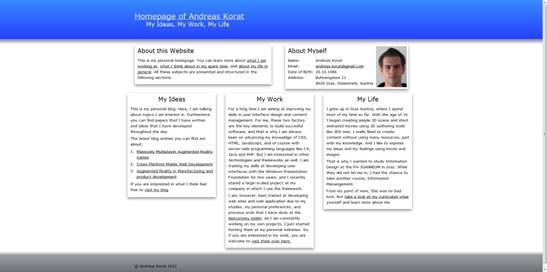
Figure 2 - Desktop Homapage on Google Chrome
In contrast, Figure 3 shows the website on an HTC sensation in both landscape and portrait mode.

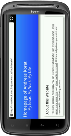
Figure 3 - Website schreenshots from an HTC Sensation
The content can be scrolled easily without the need to zoom in. While the user cannot see the complete page at once and therefore does not know about the whole content of the page, he still gets the most important information right away and can be guided to the information he is looking for.
However, some drawbacks might arise from this approach of displaying website content if the website developer does not take care enough. The website in Figure 3 might suggest that the content ends with the section “About Myself”. As the user does not see the whole page, he could assume that there is none. Even when the website is viewed in landscape mode the content fits into the view perfectly. While this behavior was not intended or predicted, it presents a new challenge to the developer to show the website visitor that there is additional content on the page. One example would be to use the CSS content property to add more information to the page that indicates that the user can scroll down.
4 Mobile web application development
With the upcoming HTML5 Standard and CSS3 a lot of new features are added to modern web browsers and, fortunately, most mobile web browsers are state of the art. Thus web applications that are aimed to be used on mobile devices can use a lot of modern features like built-in calendar controls or local data storage. What is more, due to the support of modern CSS features and standard compliance of modern browsers, developing websites and web applications that work on all major browsers becomes easier. Additionally, as modern web browsers ship with faster and more capable JavaScript engines client-side programming becomes more important and several JavaScript based mobile application development frameworks have been established so far. Thus, this chapter will introduce two JavaScript based libraries that simply the development of mobile web applications.
4.1 JQuery Mobile
According to the developer website JQuery Mobile is a touch-optimized JavaScript framework for Smartphones and Tablets. It is build on top of the popular Jquery JavaScript library and works on all major browsers on mobile platforms. Support for the following platforms is stated: iOS, Android, BlackBerry, Bada, Window Phone, Palm Web OS, Symbian, as well as MeeGoo [4]. A list of all platforms and browsers the library has been tested since development began is listed at [4].
The aim of the framework is to let the developer design a single highly branded and customized HTML based website and transform the output to an application that looks the same on all kinds of devices. Further design customizations can be made using the JQuery Mobile Themeroller which can be found at http://jquerymobile.com/themeroller/. Similar to the JQuery core library, the mobile version is designed to be extended by plug-ins. A list of helpful plug-ins can be found at http://jquerymobile.com/resources/#Plugins.
4.2 JQuery Mobile sample application
A simple application is created with JQuery Mobile to test the frameworks’ capabilities. Therefore, the “task manager” app is developed.
The app consists of three views:
- The main view
- The create task view
- The show random task view
All created tasks are listed as expandable entries in the main view. Below this list is the menu that provides a link to the create task view, the show random task view, which opens a popup window, and a link to settings, which is not implemented.
Clicking on the create task view switches the interface similar to Androids activities. It shows a new window in which the user can set the name of the task, a task description, and the date of the task. Both the main view and the create task view are shown in Figure 4
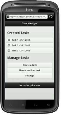
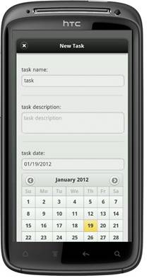
Figure 4 - Task Manager UI (JQuery Mobile)
While the design of the user interface looks impressing, the performance of selecting text boxes, opening dialogs, and switching activities was far from perfect. This was very disappointing as all tests were performed on the HTC Sensation, which is one of the more advanced Smartphones at the time of writing.
There were some bugs in the user interface as well. The date picker component, for example, was instantiated and added to the user interface multiple times.
4.3 Sencha Touch
Sencha Touch is an HTML5 Mobile Web Application framework that lets developers create mobile applications that imitate the look and feel of native applications on iPhone, Android, and BlackBerry touch devices[5]. In contrast to JQuery Mobile, which for most parts uses plain HTML and CSS to display the application, Sencha Touch uses JavaScript to declare user interfaces exclusively. Hence the framework might be better suited to programmers than JQuery Touch.
Sencha Touch uses modern HTML5 and CSS3 features and ships with several themes. The framework mainly targets WebKit-based browsers and thus includes some advanced features like displaying dynamic charts or video files that are built with mechanics that might not be available in all modern browsers http://www.sencha.com/products/touch/demos/.
By default HTML files that include Sench Touch use the HTML5 Doctype and include the Sencha Touch CSS and JavaScript file. Developers then can add their own application logic to display user interfaces. The next section shows an example JavaScript Code written for Sencha Touch. It shows how to set up an application and display user interface elements. First, start up images are defined and an icon is defined that can be displayed on iPhone home screens. Setting the property glossOnIcon to false indicates that iOS should not add its own visual effects to the home screen icon. Once the HTML document is loaded in the browsers the onReady method is called and adds a Sencha Touch TabPanel to the website [6]:
Ext.setup({
Icon: ‘icon.png’,
glossOnIcon: false,
tabletStartupScreen: ‘tablet_startup.png’,
phoneStartupScreen: ‘phone_startup.png’,
onReady: function(){
new Ext.TabPanel({
fullscreen: true,
type: ‘dark’,
items: [{
title: ‘Tab 1’,
html: ‘
This is a place for HTML
’Feel free to add your content
’,cls: ‘card1’
}]
})
}
});
Using this approach, complex applications can be built for modern browsers with just a few lines of code. The actual outcome of this code can be seen in Figure 5:
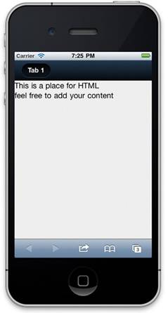
Figure 5 - Sample Sencha Touch Application []
The framework is build with the intention of building applications that provide a similar user experience as native mobile applications. Therefore most user interface elements that can be found across mobile platforms are integrated. The framework ships with a set of stylable buttons, all common form elements and their individual appearances across multiple mobile platforms, linear and nested lists, icon sets, toolbars, vertical and horizontal carousel layouts, tab layouts, Google Map layouts, audio and video players, and overlays. Examples of all user interface elements can be found at [http://dev.sencha.com/deploy/touch/examples/kitchensink/].
According to [6] Sencha Touch applications and the process of building them are more similar to native applications than using JQuery.
4.4 Sencha Touch Sample Application
The same task manager that was created using JQuery was also implemented using Sencha Touch to better compare these two libraries. Sencha Touch fells more advanced and professional that JQuery, but the framework is more difficult to understand as well. The declaration of the user interface feels quite complicated, but the advanced data binding mechanisms will definitely help creating advanced user interfaces.
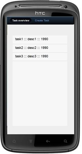
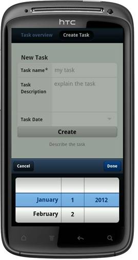
Figure 6 - Sencha touch Task manager app
The Sencha Touch UI responded not as fast as the native UI, but it was an improvement considering the performance of JQuery Touch. Furthermore, no bugs occurred and the UI could be used in a productive environment.
5 Literaturverzeichnis
1. Gartner Internet access PC / Mobile. Gartner Internet access PC / Mobile. [Online] [Zitat vom: 24. July 2011.] http://www.gartner.com/it/page.jsp?id=1278413.
2. Advantages of Web Applications. pssuk. [Online] Paul Stanley Software, 2012. [Zitat vom: 20. January 2012.] http://www.pssuk.com/AdvantagesWebApplications.htm.
3. Gasston, Peter. The Book of CSS3. San Francisco : No Starch Press, Inc., 2011. 1-59327-286-3.
4. jquery mobile. [Online] [Cited: January 20, 2012.] http://jquerymobile.com/.
5. Sencha Touch. sencha. [Online] [Zitat vom: 20. January 2012.] http://www.sencha.com/products/touch.
6. with, HTML5 Mobile Websites: Turbocharging HTML5.
7. css media queries for internet explorer. ghita.org. [Online] [Zitat vom: 2012. January 17.] http://ghita.org/tipoftheday/css-media-queries-for-ie.